
Designing Alignment: A Scalable Web Design System for MNTN
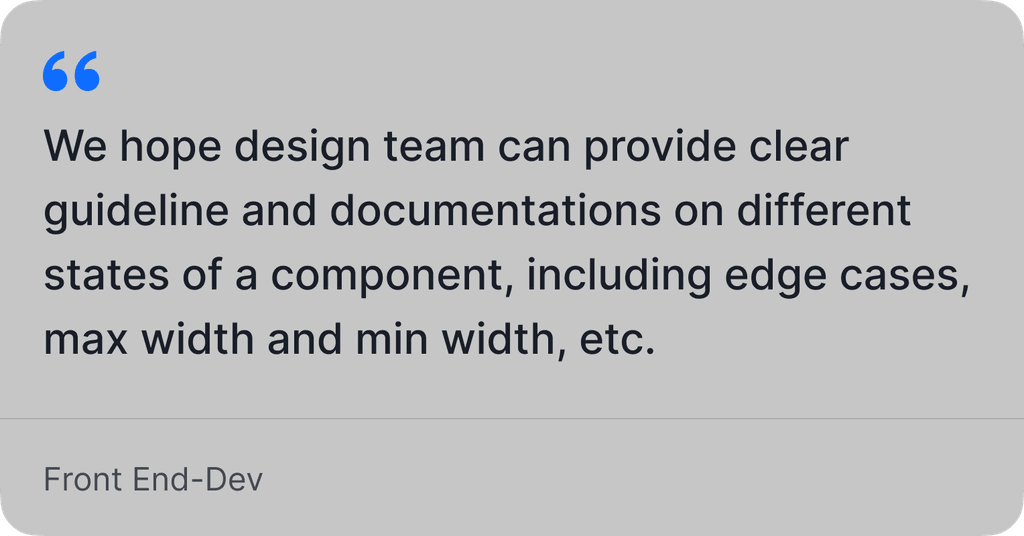
I was the leading designer of MNTN's comprehensive web design system for responsive web and mobile platforms. Established design foundations, crafted reusable components with design guidelines with corresponding design tokens in Figma. I collaborated closely with the engineering team and introduced accessibility documentation to ensure a consistent, inclusive user experience across all touch-points.
As a result, the new system reduced maintenance overhead by 50%, enabled rapid brand setup, and streamlined the design-to-development handoff.
MY ROLE
Lead Designer - Design System
TEAM
Developers
Design Team
TIME
2024 - 2025
RESPONSIBILITIES
Design System, Wireframe, UX/UI Design, Documentation


✦
Implementation Goals
02
Establish a unified design system to eliminate design duplication, standardize visual language across all platforms, implement consistent naming conventions, and streamline design-to-development handoffs.
Success metrics:
Reduce QA tickets by 90%
Achieve 90% visual consistency across product interfaces
50% reduction in dev team maintenance
▸
Research That Shaped the Foundation
03
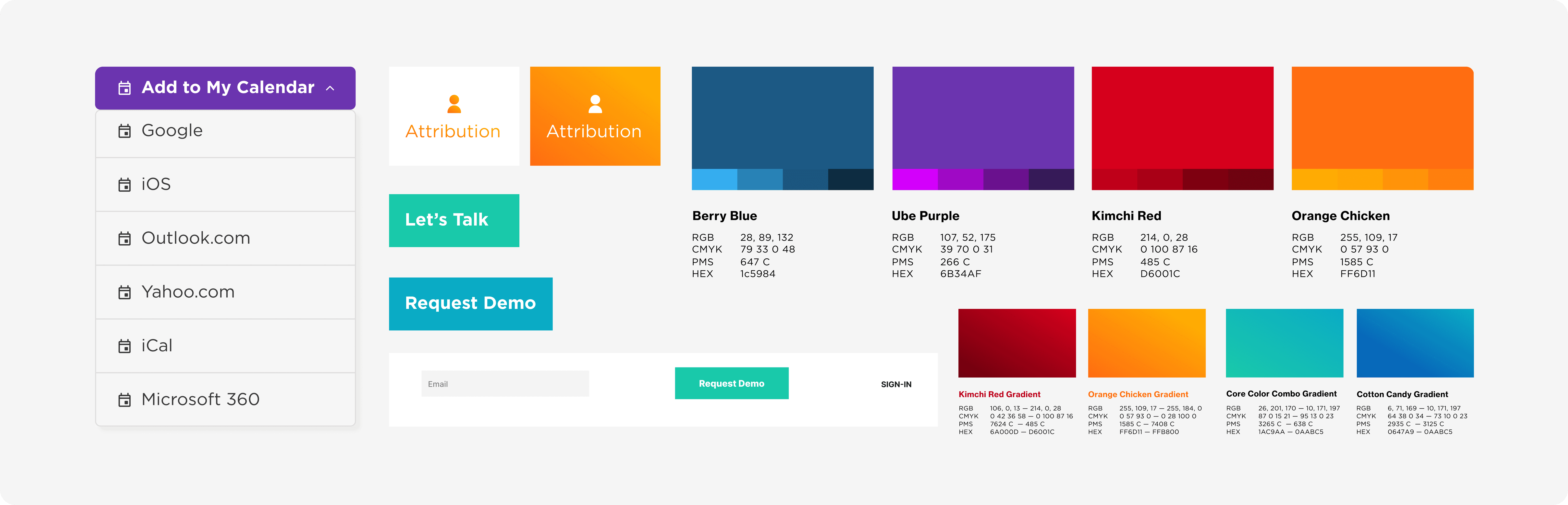
I started with a comprehensive audit of existing design patterns, deconstructing live pages into individual UI components to understand current usage. Partnering with a front-end developer, we extracted and cataloged all UI variables to ensure technical alignment. We took an iterative approach, systematically reviewing and documenting each component to build a solid foundation for the design system. Here are some legacy components.
▸
Creating the Token System
04
I structured our design tokens using Style Dictionary conventions, implementing clear names and semantic alias layers for consistency. Using MNTN's main colors as visual examples:


Here’s an overview of the improvements I made: I refined the color palette to ensure accessibility compliance, created a reusable template for brand designers to easily drag and drop design inspiration, updated the card system for better consistency, and restructured the button components for clearer hierarchy and easier implementation.

Handoff documentation typically begins with an overview of the design token system, followed by a comprehensive documentation sheet covering component specs, usage guidelines, and developer notes.