
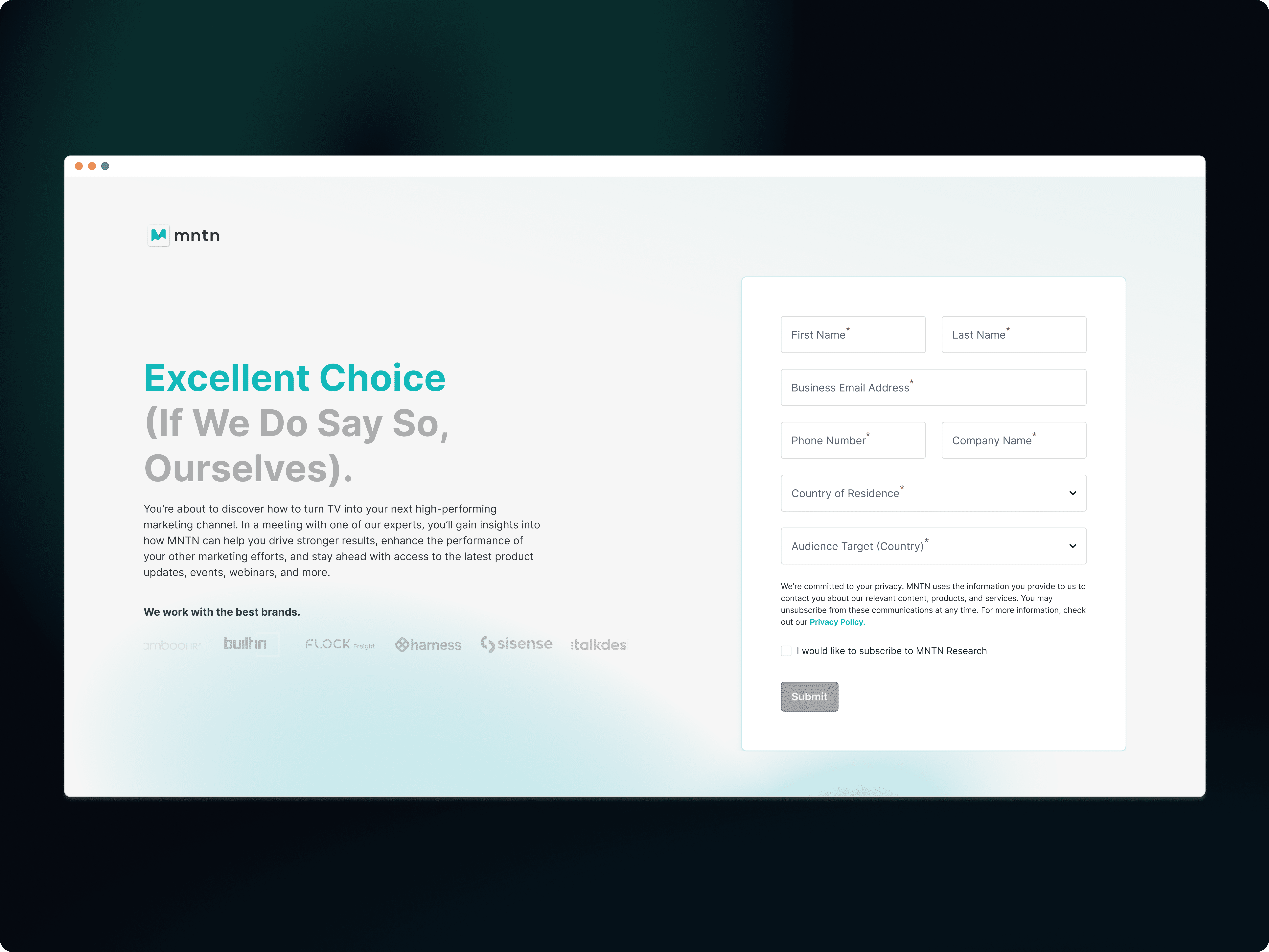
Building targeted flows that convert prospects to leads
MNTN is a B2B adTech company helping brands launch campaigns on CTV and streaming platforms. The redesign improved product clarity, strengthened brand positioning, and boosted engagement and lead conversion. The new landing and feature pages increased conversion rates by 35%, scroll depth by 17% (to 50%), and reduced bounce rates by 20%.
MY ROLE
TEAM
PMs, Content, Developers
TIME
2023 - 2025
RESPONSIBILITIES
Visual Design, Design System, Wireframe, Ideations, A/B Testing


✦
How Might We…?
02
Reimagine a guided experience that communicates MNTN's value and empowers marketers to take action with confidence and ease?
▸
Heatmap Analysis and Marketer Feedback
03
Partnered closely with the content marketing and product marketing teams, I investigated how users were interacting with the existing one-pager by conducting five user surveys. I also pinpointed areas with potential for improving the user experience, collaborating with art directors to ensure the new UI matched the existing brand voice.


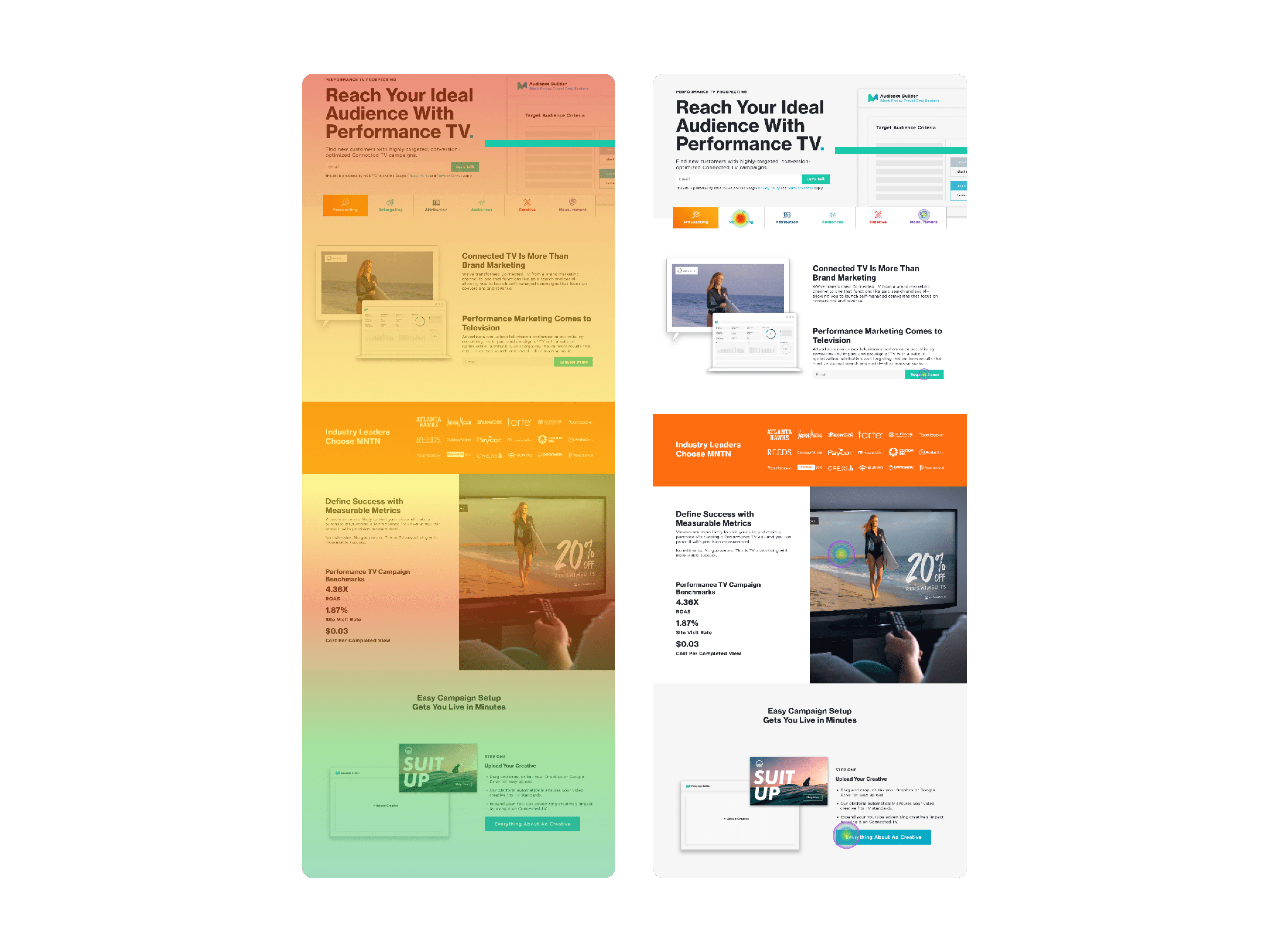
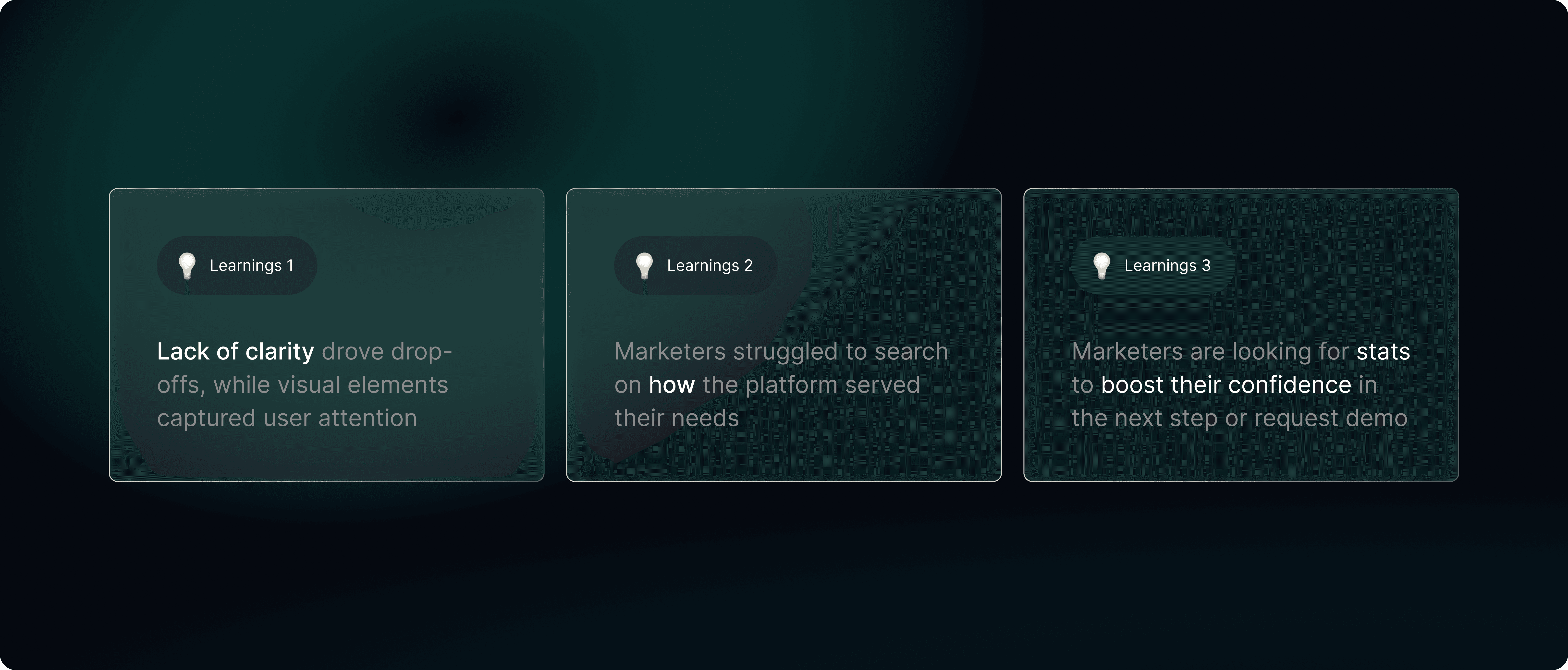
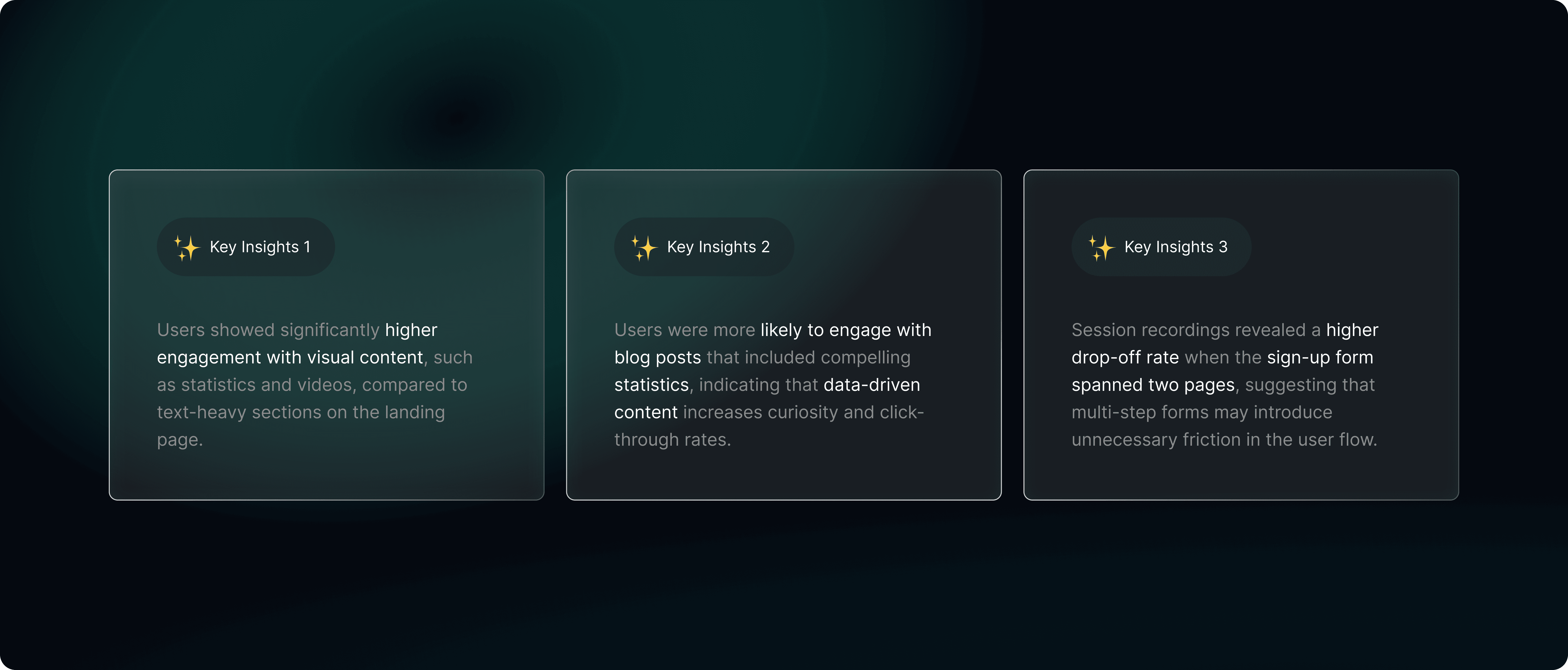
Hotjar heatmaps revealed high engagement with B2B-focused content and performance stats; however, unclear messaging and lack of directional hierarchy caused drop-offs, signaling missed conversion opportunities. I also observed that users paused most at data visualizations, animated brand logos, and bold headings.
▸
Understanding Competitors and Seeking for Opportunities
04
To improve clarity and relevance in our product experience, I conducted competitive analysis to identify the strengths, weaknesses, and opportunities in rival solutions. This helped benchmark UX/UI patterns, uncover industry standards versus innovation gaps, and validate or challenge assumptions about what users expect, ultimately guiding more strategic and user-aligned design decisions.
I defined a two-tier user segmentation in the product tab: Goal-oriented users vs. first-time visitors exploring MNTN’s product capabilities, ensuring the experience supports both focused tasks and exploratory discovery.
▸
A/B Testing Features with Marketers to Validate Design Assumptions
05
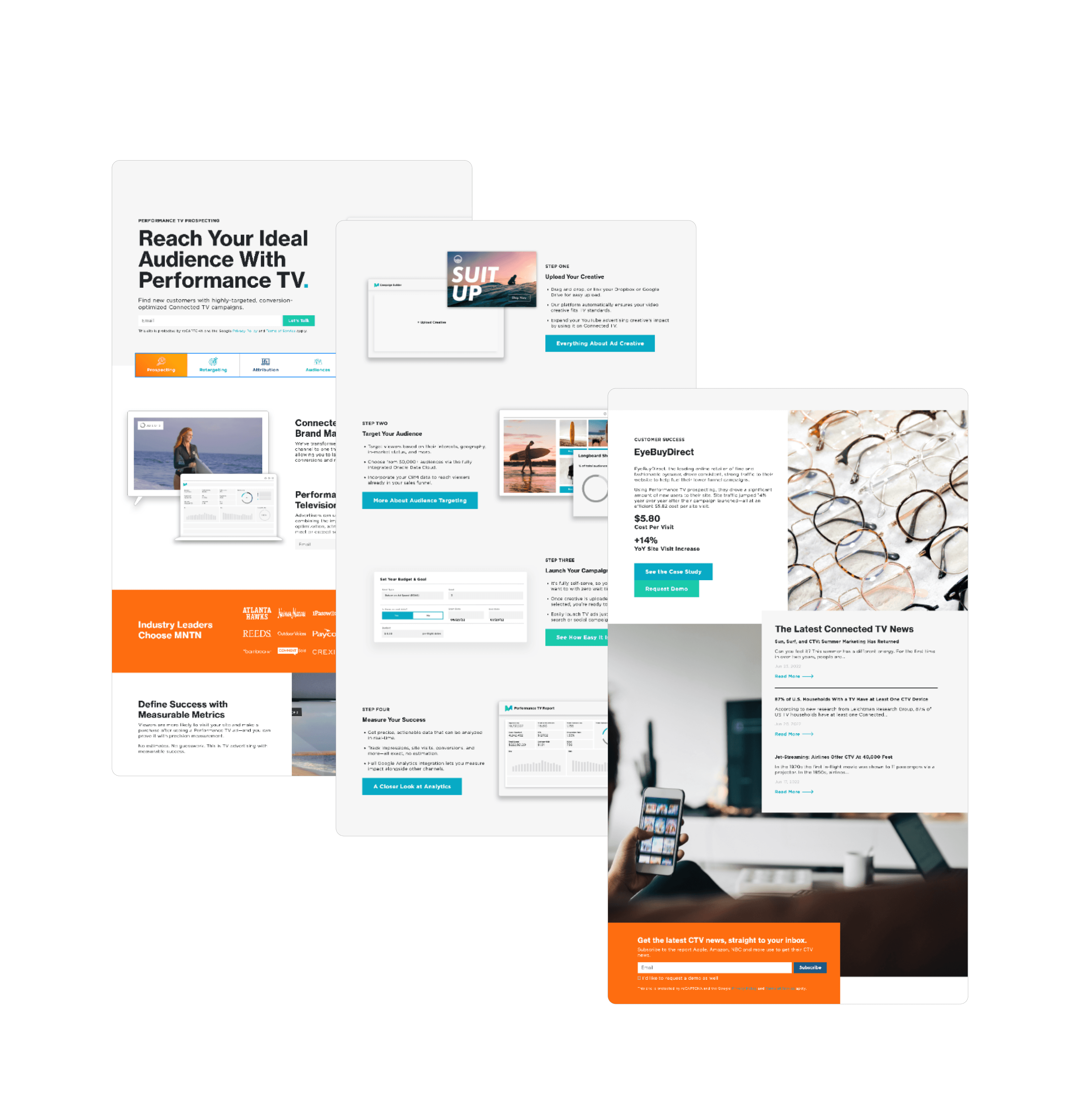
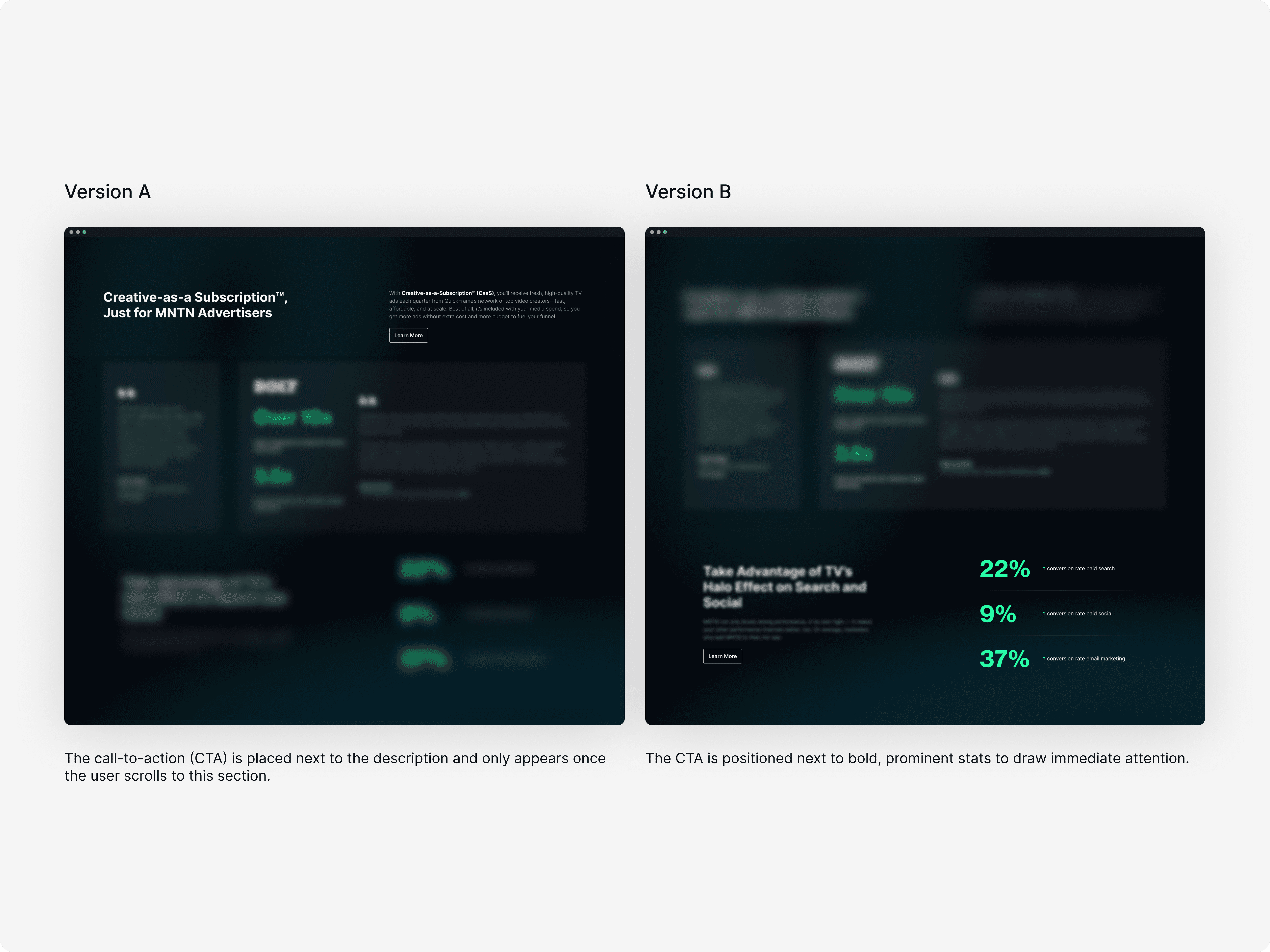
I designed multiple versions of wireframes and prototypes with an ideal experience in mind and ran a number of user tests. My main focus of the user testing is to validate my assumptions, such as the overall user experience of the page, select sign-up CTA around stats areas, the overall sign-up flow, and identify areas of improvement for copy (including the voice and tone).


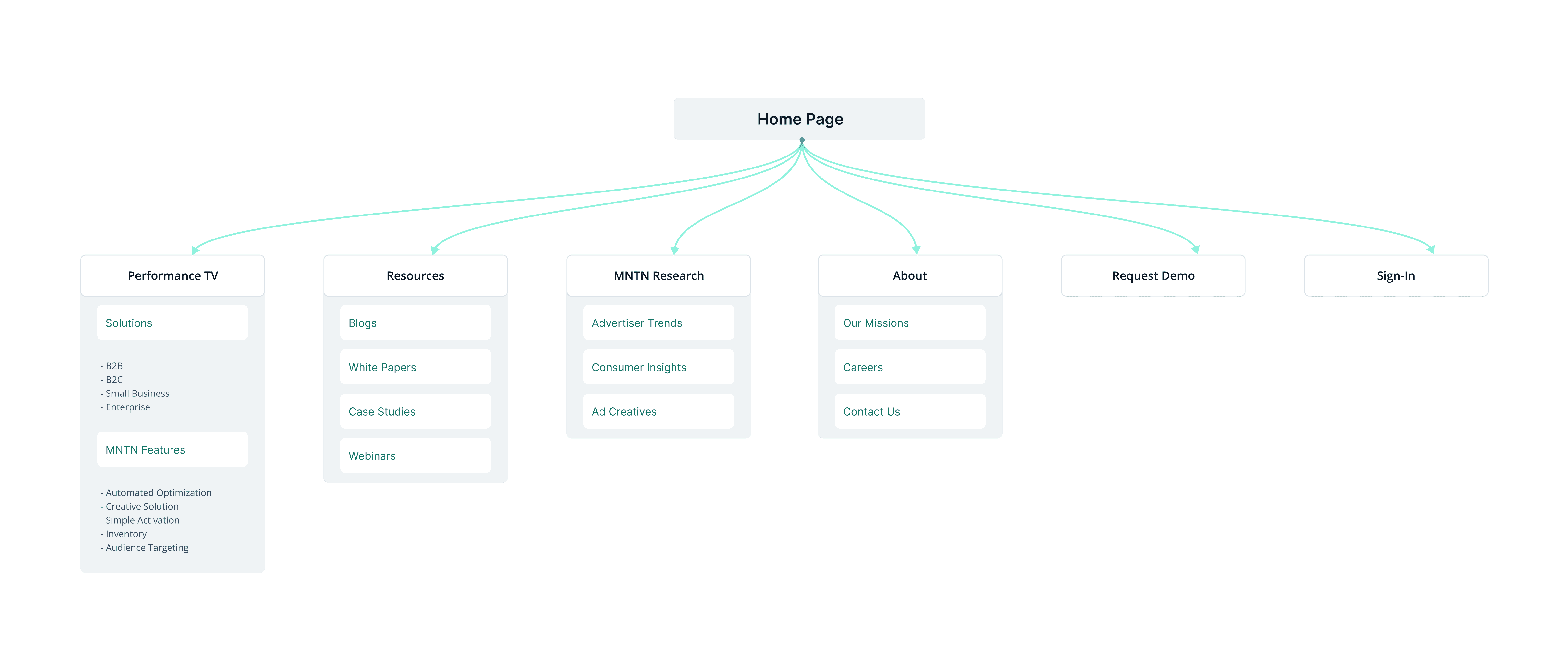
I delivered targeted landing pages tailored to different marketer segments (B2B, B2C, and others), incorporating key statistics, resource links, and subtle web animations to deliver visual proof points. I also designed a full-stack component library in Figma for web use, supporting the entire marketing team to build templates.

Additionally, I introduced a dedicated case study section to the website to strengthen SEO performance, increase organic traffic, and create more opportunities for user engagement and sign-ups.
Reimagine blog interactions from one-pagers to interactive blog posts due to our high traffic.