

Overview
Amobee is an automated platform with data expertise to help the user grow their business. It’s the only unified advertising platform for TV, CTV, digital and social. The user can optimize their ads/campaigns with unified workflows for planning, buying, and measurement that drive incremental performance with the Amobee advertising solutions.
The goal of this project is to focus on designing tools for broadcasters using the Amobee platform, enabling them to maximize revenue across all forms of TV through intuitive, cross-platform solutions for planning, sales, and measurement.
My Role
UX/UI Designer | Product Designer
Duration
~2month
Team
Product | Content | Developers | PMs
User base
Feature served +80,000 users daily
Key Success
Received a overall ~85% positive usability feedback
~75% of users (marketers) comment on having a faster user experience on the measurement table
Exploring the User Pain-point
Preliminary research provided
Before kicking off the design phase, the Amobee ATV Product Management team had already begun gathering user feedback to validate their product direction. One key insight they shared with me was a recurring user pain point: users had to make the same edits across multiple campaigns, requiring repetitive clicks and manual effort. This workflow was not only inefficient but also time-consuming, leading to frustration and slower campaign execution.
Challenges
User Access Constraints: Multiple users shared the same account, but permissions were limited—users could only edit campaigns within their assigned plans. This required careful UX consideration around visibility and edit access.
Cross-Functional Alignment: The team operated across multiple time zones and regions, with tight deadlines structured around four rapid release cycles. Aligning priorities and maintaining communication cadence across PMs, designers, and developers presented logistical hurdles.
Engineering Limitations: The shared component library was still under development, meaning many components needed to be custom-built or adapted during implementation—adding additional strain on design-dev collaboration and testing.
System Constraints: Technical restrictions within the existing platform architecture required compromises in interaction design and dictated phased rollouts of core features.
Technology relevant: The unified component library was not fully built at the time.
End-Users
All broadcaster users
External clients
Global users
Research & Explorations
User Research & Insights
To initiate the redesign process, I collaborated with the PM team to conduct a usability study through Userlytics, engaging five end-users to observe how they navigated the campaign creation and editing workflow. Our goal was to surface friction points, inefficiencies, and areas for improvement in the platform’s UX.
Research Objectives
Map the full end-to-end editing experience to uncover usability gaps and bottlenecks
Identify redundant or low-value features that added cognitive or operational load
Uncover opportunities to streamline navigation and reduce user frustration
Key Findings & Opportunities
Entry Point Friction: Users needed a faster, more intuitive pathway from the dashboard to the campaign editor.
UX Inconsistency: Significant differences between Amobee’s two core products caused confusion, signaling the need for a more unified and cohesive user experience.
Lack of System Feedback: Users were unsure if their edits were saved due to lag and missing confirmation cues—prompting a need for clearer feedback states and improved system responsiveness.
These insights laid the foundation for prioritizing enhancements that would simplify workflows, align interaction patterns across products, and build trust through responsive system design.

The legacy edit form
Design Process
Interviews
Stakeholders
To complement user research, I conducted interviews with members of the Amobee PM and engineering teams. My goal was to identify priority features from a business perspective and uncover any technical constraints that could impact the user experience.
Key insights gathered included:
A clearer understanding of the product roadmap and upcoming feature dependencies.
Identification of technical limitations that could affect design decisions.
Alignment on which user pain points to address in the next iteration.
Technical requirements
Need to re-build the component library
Business goals
User growth opportunities
Maximize user engagement and improve efficiency for users
Provide better service (feature)
User flows
I created two user flows based on what the end-user/fan would do on the platform:
Flow 1 - Edit one campaign
Flow 2 - Edit multiple campaigns

Flow 2 - Sort Dashboard

Design Iterations & Challenges
With the core user flows defined, I began exploring design directions focused on improving workflow efficiency. A key challenge was ensuring my proposed solutions aligned with the larger unification initiative led by the UX team—aimed at creating consistency across Amobee’s product suite.
This required a thoughtful balance: preserving familiar structures within the existing platform while introducing enhancements that offered measurable value to users. I consistently referenced established design patterns from the DSP (Demand-Side Platform) product line to maintain visual and functional alignment, supporting a cohesive user experience across products.

These are some of the messy try outs that I did:

With all the try-outs, I picked a handful of mocks and validated my design with the end-users. Here are some insights/feedback I got through each user-testing sections.
Ideation #1

“I like the search function, but not sure about other button...what are some new features you were thinking about again?”
What I added:
Search function
Sorted all the relevant plan names together
Added checkboxes (showing activated campaigns)
Hierarchy table switch button
Feedback: negative
Ideation #2
“I like this one better than the other one (Ideation 1), but not a big difference.”
What I added:
Search function
Sorted all the relevant plan names together
Added checkboxes (showing activated campaigns)
Hierarchy table switch button
With a notification to guide the user
Feedback: negative
Ideation #3

“Clear and clean. I am excited.”
What I added was:
introduce the Hierarchy table
Plans are now acting like folders
Feedback: Very positive
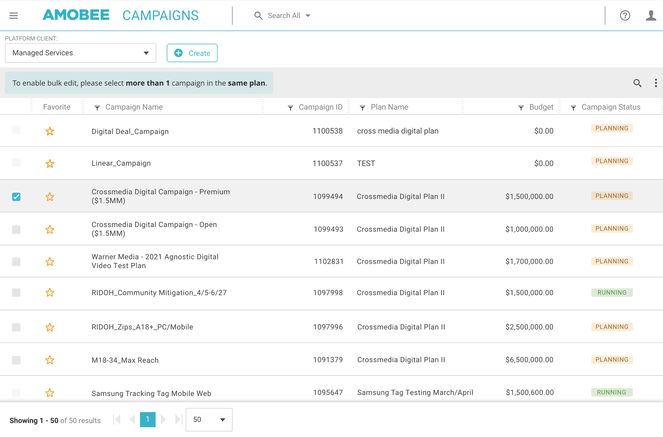
With the positive direct feedback from 85% of the end-users, I created a user flow as below.
-
![]()
Selected multiple campaigns
-
![]()
New Bulk edit from


Usability Testing
Final Testing & Development Handoff
After completing the final round of user testing and refining the first set of mockups in Figma, I handed off the designs to the engineering team for development on the Beta site. Once the Beta was live, I conducted another round of testing with the same end-users, this time evaluating the Figma prototype.
Key Insights:
Building a clean, well-organized prototype in Figma significantly streamlined the development process and minimized engineering time.
Collaborating with the engineering team, we integrated usability testing on Userlytics, where users were tasked with:
Finding a campaign in a specific plan.
Activating the bulk edit form.
Testing Results & Insights
The testing results were overwhelmingly positive. 5 out of 5 users successfully completed Task 1, and 4 out of 5 were able to easily activate the bulk edit form. Reflecting on the original problem statement, the redesigned dashboard table significantly reduced the number of clicks required to complete key tasks, improving overall efficiency.
Improvements and aftermath
User Feedback & Iteration
While the usability test yielded positive results, some end users provided valuable feedback regarding the submission tracker and navigation within the bulk edit form. Two key areas for improvement were identified:
Providing clearer guidance through the navigation system in the bulk edit form.
Implementing a faster way to activate the submission tracker.
Based on this feedback, I iterated on the design and developed a full mockup, incorporating the following enhancements:

Navigation with guides

Submission tracker is now on the dashboard table

The user can easily submit another round of bulk edit request. Also, here are many cases where multiple users shares one account, this way the user just need to see the “request #”.
To be continued…
The project is now currently on another round of usability testing for the drop 2 added features.